insanity
Private Eye
 I'm on Fire
Posts: 50
|
Post by insanity on May 2, 2007 14:03:09 GMT -5
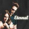
Jensen looks awesome, and I love his expression. The font looks pretty cool, but I wish you had added a few more effects, to make it look more complete.
9/10
|
|
|
|
Post by tvilike admin on May 13, 2007 14:37:23 GMT -5
Awesome banner!! The blending is seamless, the colors are very vibrant and the font suits the anime look perfectly. Good layout of all the images...
10/10
|
|
The Batboy
Private Eye
Mr. Batgirl
Support Season 8
Posts: 376
|
Post by The Batboy on May 17, 2007 12:28:58 GMT -5
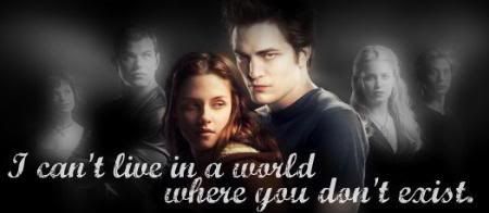
Claire! Gosh, she has got to be my favorite Heroes character! I like the banner, blended REALLY well, though I think you have a bit TOO much going on. The banner is nice, and so are the pile of Binis, but I dunno... I think you need a Claire Bini^^
8/10
|
|
insanity
Private Eye
I'm on Fire
Posts: 50
|
Post by insanity on May 24, 2007 1:52:12 GMT -5
I love the color in this banner, it just makes it pop! Excellent Text placement, and I love the picture arrangement along with their poses.
10/10
|
|
|
|
Post by SlayerLV on May 24, 2007 2:27:46 GMT -5
I love the new banner, the green tint over the back pictures looks cool and I like the font of the text.
10/10
|
|
grave
Private Eye
Posts: 317
|
Post by grave on May 24, 2007 5:33:43 GMT -5
I like the banner.... Blending is good, but the images are a little pixalated. Other than that, its really nice  8/10 |
|
|
|
Post by shep on May 24, 2007 10:07:31 GMT -5
I can tell its your banner Grave, you definately have a 'signature banner' (the tones you use).
Its nice to see a Charmed banner. Beautiful pics of the girls, great blending
10/10
|
|
insanity
Private Eye
I'm on Fire
Posts: 50
|
Post by insanity on May 24, 2007 17:43:04 GMT -5
I love the blondes from charmed! One of my favorite eps. I like your pics and how the text color relates to the blonde theme.
9.5/10
|
|
grave
Private Eye
Posts: 317
|
Post by grave on May 24, 2007 19:22:32 GMT -5
LOVE the bini banners you make. I watched Naruto with my cousin yesterday, lol and must say it wasn't as bad as I thought it would have been  Love the border etc. Only nit-pick is the text, not a fan... but that is just tiny. 10/10 ;D |
|
|
|
Post by SlayerLV on Jun 9, 2007 3:01:15 GMT -5
I love the pictures you used and the texture, although I feel like it could use just a bit of text.
9/10
|
|
|
|
Post by tvilike admin on Jun 9, 2007 10:27:14 GMT -5
Cool!!! I like that banner very piratey!!! Nice Blends and the layout looks like a clasic pirate map... The fonts work well with the theme and the tag line is cool... Elizabeth pics are so awesome 10/10 |
|
grave
Private Eye
Posts: 317
|
Post by grave on Jun 9, 2007 20:34:27 GMT -5
I like this banner!  Good pictures, flawless blending and nice 'n simple! Only thing that is missing IMO is a little border. Other than that I'd give you a 9.9999/10 |
|
|
|
Post by tvilike admin on Aug 12, 2007 13:55:52 GMT -5
I really like this banner....
Chris your blending and use of effects really make the banners pop with a vivid spark...Overall it is fantastic!!!
10/10
|
|
|
|
Post by madvicks on Aug 12, 2007 15:44:06 GMT -5
I really like the blending on Claire and the colour works well. What I'd expect from the Master! LOL! 10/10 ;D |
|
Knight_Of_Cydonia
Private Eye
Behind These Eyes One Finds Only Darkness. These Are The Eyes Of A Psychopath
Posts: 232
|
Post by Knight_Of_Cydonia on Aug 12, 2007 18:24:49 GMT -5
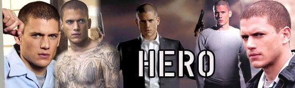
Very nice, I love how you have like 3 banners in one. They all look very nice, and are blended very well
10/10
|
|