grave
Private Eye

Posts: 317
|
Post by grave on Mar 15, 2007 11:02:03 GMT -5
I like this banner.
The blending is AMAZING.... no rough edges or anything.
The only thing I think is missing is some colour, but that is just IMO.
Other than that, its really nice.
10!!!!!!
|
|
|
|
Post by poprox82 on Mar 15, 2007 18:40:44 GMT -5
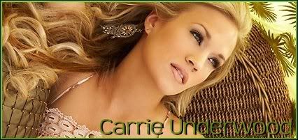
cool banner Grave, Anne is one of my fav episodes! The pics look really good and the coloring is nice. 10/10
|
|
|
|
Post by shep on Mar 16, 2007 11:48:02 GMT -5
I dont know who this woman is but she is very pretty and I love her cheesy smile!
The font is a nice text also
The backgound colour is a little dull - so you get a 9/10
|
|
|
|
Post by SlayerLV on Mar 17, 2007 2:02:25 GMT -5
oh yea all these girls definately kick ass, I love the Charmed picture and the 2 of Alice from Resident Evil
10/10
|
|
|
|
Post by poprox82 on Mar 17, 2007 10:30:31 GMT -5
awesome banner!!! 10++++++/10
|
|
|
|
Post by shep on Mar 18, 2007 5:42:33 GMT -5
I am not keen on Joss with this pink/red hair eeerrrhhh
However I think the photos have been blended brilliantly and I like that you chose similar poses at the beginning and ending of the banner, 10/10
|
|
The Batboy
Private Eye
Mr. Batgirl
Support Season 8
Posts: 376
|
Post by The Batboy on Mar 19, 2007 22:32:39 GMT -5
Kick Ass Girl Power^^ Love the cutting, it looks so smooth. Maybe more characters and not the same ones would be nice, but I love the Charmed Ones in the middle!
9/10
|
|
|
|
Post by SlayerLV on Mar 19, 2007 23:16:34 GMT -5
I love it, Butters is my favorite South Park character, and I thought that episode was funny, although I dont really like the yellow overtone
9.5/10
|
|
|
|
Post by shep on Mar 20, 2007 4:17:50 GMT -5
Jessica Alba is very sexy! - I love this 'moving' banner 10/10
And the bini's get 10/10 too!
|
|
The Batboy
Private Eye
Mr. Batgirl
Support Season 8
Posts: 376
|
Post by The Batboy on Mar 31, 2007 16:51:56 GMT -5
I think people forget this thread is here... Not cool...
10/10, I really do like the crispness of the banner and though the text kind of bugs me, the Bini makes up for it ^_^
|
|
|
|
Post by Sammie on Mar 31, 2007 17:12:07 GMT -5
Great banner, very original. I love the background texture, with the pretty lighting... i don't know the character but it looks cool, a bit mystical. The font is simple and it fits. Also like your matching bini  9/10 (because i think it would stand out more if it was a bit smaller, if that makes sense) |
|
|
|
Post by SlayerLV on Apr 1, 2007 0:58:03 GMT -5
I love the picture, but it is kinda plain
9/10
|
|
|
|
Post by Sammie on Apr 1, 2007 16:39:35 GMT -5
This banner is kinda cool, i like the main picture, even though i've never heard of this guy. The blending is well done and the colors are warm and sunny. I also like the way the text was added, nice font as well. Overall i'd give it a
9/10
|
|
|
|
Post by CK-- on Apr 1, 2007 17:51:15 GMT -5
Very Cool "Gothic" view of Hogwarts, I love the mood that this banner conveys...well done!
8/10
|
|
|
|
Post by shep on Apr 2, 2007 5:36:34 GMT -5
I have only seen a few episodes of this programme.
It is an amazing banner with a strong font 10/10
|
|