|
|
Post by madvicks on May 12, 2007 8:32:33 GMT -5
Chris has been tutoring me in gradient maps and I have produced this with his expert help!  |
|
|
|
Post by madvicks on May 12, 2007 13:58:03 GMT -5
I saw Ali's banner request and had a go at the following:  I trued out two gradient maps to see what they look like and also added a very light texture... So light you cannot actually see it I don't think. Who said there wasn't a learning curve!  Comments appreciated as always! |
|
grave
Private Eye

Posts: 317
|
Post by grave on May 12, 2007 14:31:25 GMT -5
WOW! Look at the blending! See You are getting better and better! IMO I think that it would look better without Jake, but that is just me. Still I know its hard blending an elbow into a white b/g, lol! GREAT JOB ;D ;D |
|
|
|
Post by Lior Knight on May 12, 2007 15:20:00 GMT -5
Vicks, you are getting better and better!  JM wallpaper is awesome, colorful and very well made. The "Hotties" banner is also amazing, though I recommend replacing that Jack J. shot because it's way too bold to the image. The others are blended really well, though.  Good job! ;D |
|
|
|
Post by shep on May 12, 2007 16:09:05 GMT -5
I chose the pics Lior. Is that something you look for when making a banner?
|
|
|
|
Post by Lior Knight on May 12, 2007 17:23:17 GMT -5
Not always, sometimes you can create a nice contrast between the dark backgrounds and the light ones (like placing the dark in the middle) but the best if all the backgrounds alike, then none of the images would draw extra attention to itself. Another option is to cut the objects and create a single background (like Pedro and I do with some of our TViLike banners). In this case, different image would've worked better because the other images are blended so good, it's a shame to break that blending. |
|
|
|
Post by shep on May 12, 2007 18:10:39 GMT -5
Cheers!
|
|
|
|
Post by madvicks on May 13, 2007 8:29:52 GMT -5
I took on board the comments and have had another go, I have tried to keep the same themes in mind. I used to brush more in a layer mask to try to remove edges and backgrounds, I also cut into some of the figures closer with the lasso and feather.  So, what do you think? Is it an improvement? Where should I look to make adjustments? I really do appreciate the feedback, how else and I going to learn? Ali, feel free to swap if you prefer! |
|
|
|
Post by Lior Knight on May 13, 2007 9:19:34 GMT -5
That's so much better now! Jack fits perfectly without over shadowing others. But the rest looked better in the previous banner, IMO.
Maybe you should combine the two? take Jake and "Prison Break" guy (forgot his name) from this one and put them on the first banner.
|
|
|
|
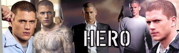
Post by madvicks on May 13, 2007 10:05:02 GMT -5
Okay, how about now? Problem is the first banner I forgot to save the Photoshop file and did it straight into a jpeg. Doh!  |
|
|
|
Post by Lior Knight on May 13, 2007 10:22:06 GMT -5
Perfection! ;D
|
|
|
|
Post by shep on May 13, 2007 10:26:03 GMT -5
Jake looks better in the photo now! Great work x
|
|
|
|
Post by madvicks on May 13, 2007 10:26:53 GMT -5
Heehee... Cool, thanks Lior! I appreciate all the feedback.  |
|
|
|
Post by Lior Knight on May 13, 2007 11:16:47 GMT -5
Heehee... Cool, thanks Lior! I appreciate all the feedback. No problem. ;D Keep up with those awesome banners. |
|
grave
Private Eye
Posts: 317
|
Post by grave on May 13, 2007 14:32:21 GMT -5
WOW!
Amazing... me loves it even more ;D ;D
|
|